About Me

My photo
Leicester, United Kingdom
Studying BA (Hons) Game Art Design at De Montfort University. It continues to be challenging as much as rewarding. Primary outcomes include 2D and 3D projects and 2am coffees.

Sunday, 29 April 2012

First Year review

It's quite surprising that this first year is already done and dusted. I recall back in September that I was feeling rather unsure how this year would pan and out and I'm amazed I've managed to get through it.
When I first arrived and sat through the 'Congratulations you're in' and 'what we expect of you' presentations, I knew the tutors were being blunt and honest with us. It made me believe that I wouldn't last long in boot camp. I had come to DMU straight from Art Foundation which I enjoyed and which had been rather beneficial from the life drawing point of view. If I had skipped that year and come right after 6th form, my drawing style would have most likely slowed me down a bit, given my attention to detail.

Visual Design: I found that in the first few weeks I was spending far too much time on my thumbnails after comparing mine to others. I soon realised that the thumbnails didn’t always require such great detail, their purpose was for me to understand the composition of whatever it was I was drawing. The archway is a good example of this little issue of mine. When I saw it, I felt the need to include every stone in the final piece. In the end it turned out looking rather poor. So from this I now use my judgement to decide when it is appropriate to have excessive detail in and when to leave parts out and simplify it.

Original Final: too many bricks,  takes the focus away from the overall piece


Reworked Final: less bricks, now more focus on the archway itself

During reviews with Chris I have taken onboard the advice and comments he has given me. The one thing I thought most important was ''Play to your strengths''. Indian ink and fine liner pens are my two favourite mediums and I think also are my strengths. I love using them in my pieces and it really shows they’re my favourites when they’re finished. The end result really pleases me.  This was a relief because over the months I have felt compelled to 'get with it' with digital painting, considering seeing certain other peoples finals makes me die a little inside. Don't get me wrong, I have begun to use it more often and I'm slowly getting there. I am happy to continue using methods I am most confident with.

Digital Painting: Several student friends share this opinion. Throughout the year we have agreed that we would have liked to have had pointers or tutorials as to how to start it since it wasn’t something everyone was familiar with. I know some have had previous experience with the tablets, but I was totally new to it. I recall how during my reef character, I struggled to make progress due to my detail habits. I only did three digital finals this year, quite disappointing I know yet I am rather pleased with them as they came out as I’d intended, especially after sufficient practice.

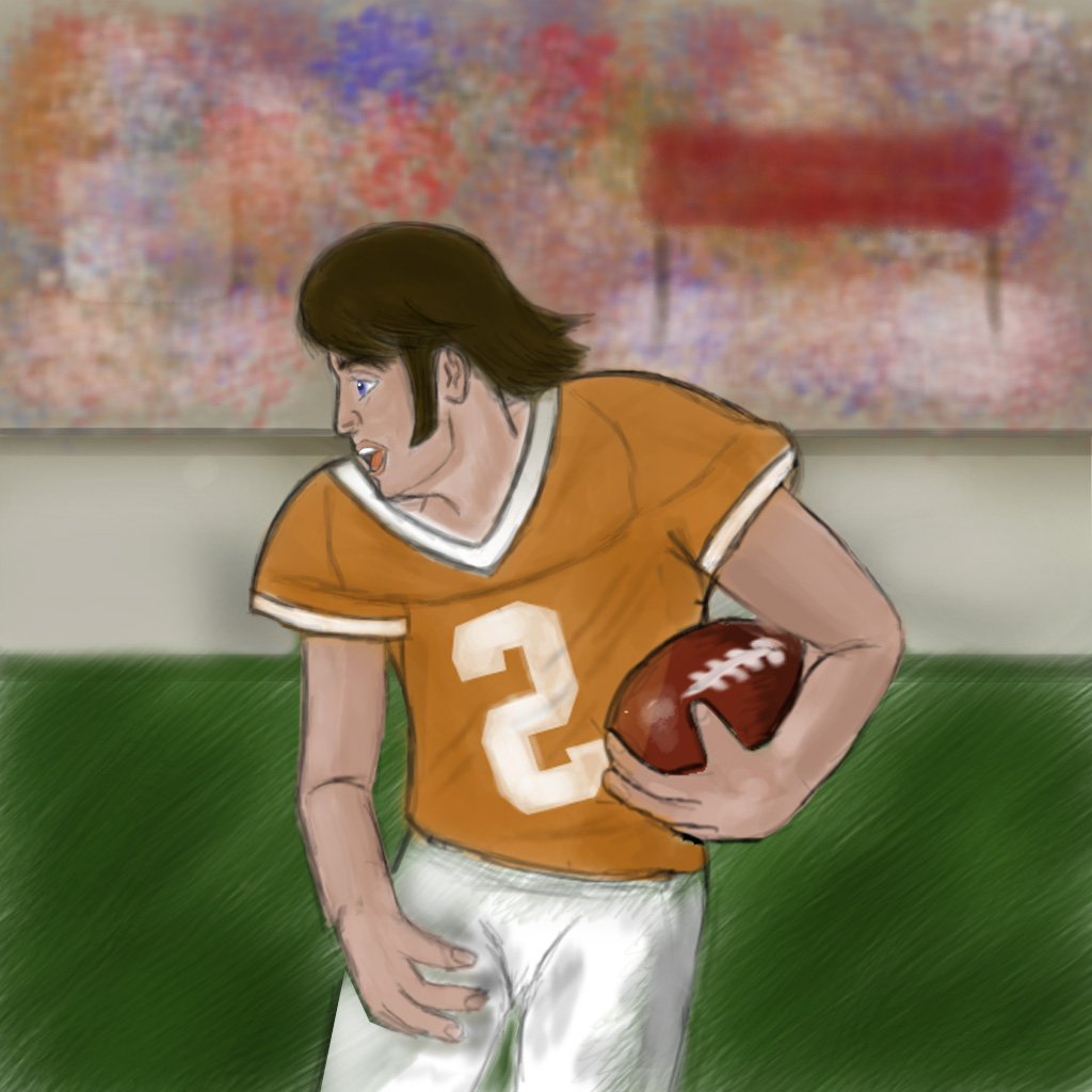


If digital painting guidance could be made a larger part of the Visual Design schedule it would be a great addition, as it is the way forward for concept art and a vital part of portfolios. Another alternative would be to have this as a part of the Guru projects. I know that each group will have different projects set depending on what the grasshoppers ask for, yet it would be very beneficial to those who are new to digital.

As with most people, I have been a victim to stress and pressure here and there as a result of bad planning and big intervals between staring and finishing. However, it has helped motivate me and see things through to the end. On this note, it is common for rushed pieces to not look to the best of your abilities, but with my ink and pen pieces, this has not been the case so I am thankful that I'm able to produce such pieces in good time.

Game Production: However, I have managed to get the stress levels down as time has gone by, because I know what I'm doing now as opposed to when I started in September. I owe a great deal to the 3rd Year guru's whose aid was valuable, since I was a complete noob at 3DS Max when I started, I was so thankful that I was able to learn so much within a few weeks of starting. Within the 3D projects I have done well not to get carried away with the tri count and keeping to the brief, however there have been occasions where during the unwrapping I’ve had to fiddle around and decide which plane mapping is best, depending on what part exactly I’m unwrapping. Also depending on the size budget of the texture sheet, editing the components at the appropriate scale felt like quite a lengthy process.

When first introduced to Rigging I was immediately rather stumped when seeing how elaborate the process was. However, after repeating the process several times I managed to see any faults I’d introduced and found the process less painful the next time round.

In spite of all these improvements, it is still clear there are some areas that I will look for improvement from my personal point of view:

Time Management: An unfortunate trait that is shared by many students, procrastination is a part of life really, but the bottom line is I seem to do it at the crucial times. I really do start projects the day they are set, but then I have an unfortunate big gap before I pick it up again.

Resources: I need to make more use of what the uni has to offer in terms of reference and need to use facilities such as the library for background materials. Prior to getting the Autodesk software on my own PC, I was in the labs whenever I could until they closed at 5pm. Generally I wanted to figure it all out for myself so I have watched the Max tutorials provided for us, but I also need to make use of my peers and other resources rather than struggle sometimes..

Presentation: Whilst I haven’t received any crits about my final render presentations on 3D, I have changed my layouts with almost each project. For some I have shown the technical info and UV layouts, and some just showing the one render with lighting etc. Above all else I know that rendering on black backdrop is a no go!

My first year in Game Art Design has certainly lived up to my expectations and I sure know now that it is not an easy option. However, I have enjoyed it and am glad to be part of it. Despite the pressure of the more challenging work to be set ahead, I am looking forward to it.

Wednesday, 28 March 2012

The Final thing


So here it is. This project was fun as it was meant to spark our creativity and I enjoyed it because I came up with various new additions as I went along. However the honest truth is that I have not really done this to my full potential.

The reasons being for this is I made no input to this during the first week when this was set was because I was fretting over an inpending assessment. Whilst I had found a solid idea that I felt happy about, I didn't feel that I did enough for prep work, I kinda jumped straight into it, once I had fiddled around. I also noticed I didn't abide by certain rules that I listed, mostly the Thumbnails and Realism I reckon.

Looking at it now, it lacks a big variety colour, its all rather bleak with a few exceptions. But then again, maybe this is beneficial; the whole idea was that it is an abandoned ancient location. The bright colours are coming from the only signs of life, the explorer, and the natural elements (fire and water). 

Comparing to my coursemates work, I am relectant to do so, as my style has made it appear like a comic book appearence, not to say that I don't like that sort of thing, just doesn't seem suitable for this project.
In Visual Design I still havn't got the knack of two point perspective yet, however looking at the shot its appears correct from a topographic point of view. In spite of all these little things which I dont approve very highly of, The biggest mistake was Time Management!!
Always the source of all crisises within the course methinks. I could have done SO much more to this piece. I planned to add more artwork or detail to the hallway walls, and have ornamated statues between the braziers. Also I made concepts for four to five characters, yet I only put one in..... It's pretty obvious. Although I feel that the scale is right, had a zoomed out anymore I would not have been able to show specific detail in certain areas, on the hand, more room for additional features and the other characters. If they had been put in, their body language could have given a narrrative...
Despite my (not so good) evaluation, I am reasonably pleased with what I pulled off, had I done more prep work and added more props, I would have been more satisfied.

Tuesday, 27 March 2012

Characters

With a treasure hunter theme I wanted to have a team rather than have it as a solo journey like Indiana Jones. I kinda wanted to split various aspects of Indy into four or five figures. Each with a different purpose or motive. In terms of architecture I have always looked hallways with statues over twisting turning paths. Statues represent the origins of the location and give insight to the culture and history says as such as written text. Thankfully I had a couple of games and films that came to mind but I wanted to expand my reference because I didn't want this all to be based just the one or two references.


So yes, this was the sort of adventure attire I had in mind and the sort of shots I wanted to achieve. Statues also act like sentries or guardians as if even though the temple is abandoned, it's as if there are still eyes upon you....


So the kind of roles I was after was:

Leader - a bold and honest man who puts the team first. Driven by childhood stories of treasures.

Historian - a young academic who has vast knowledge of ancient civilisations. Not the most daring and is easily intimidated. However his studies are crucial to finding their goal.

Scout - One who is agile and quick on their feet. Not to be underestimated by her looks, an expert in hand to hand combat.

The Muscle - The brawn of the group, whenever force is required he's the guy for the job.

I had thought to add a fifth character who had an aura of suspicion about him, like you could tell he planned to trap the team and hoard the loot for himself. But thought I'd rather have a coporative friendly team. 


After making these basic layouts I decided I'd feel happier with a interior hallway shot, or ccentral chamber, since they have the big features.

Sunday, 25 March 2012

First thoughts

Well with no limitations I am open and free to anything. However personally I don't want to create something as open and vast like Skyrim. I want to stick to a central plot with no accessories, that way I can concentrate on polishing the gem as best I can in the time I have remaining. Action-Adventure is one of my personal favourite genres. Puzzles and riddles are a good addition to games, as it makes you more observational, and aware of your surroundings and makes you use your game knowledge. Games where I have seen this involved include:

- Darksiders: Switches and levels to activate platforms to reach your goal. Rotating mirrors to relect beams to open new passageways
- Skyrim: Dungeons contain various traps (poison arrows, flamethrowers, rotating spikeswalls) which are set of by tripwires and stepping stones. Also there are pillars with various faces on them that must be rotated to match others nearby.

I guess it's kinda obvious by now I have some sort of Indian Jones Temple idea. Furthermore I have always been fascinated by subterrainian locations, like underwater or underground areas. Another major factor I want to include is pillars, statues and archways, as I feel it gives the place an aura of importance to it. The interior of places like this say more about the plot, so I intend to do an interior shot, maybe of a hallway. a trap in motion, or the treasure revealed...

In terms of characters, generally in a story line such as this there is a single protagonist with supporting figures as well. Indiana Jones and Nathan Drake are the bold heroic figures who live for this sort of thing. It would be interesting to split the personalities into multiple figures etc. I wish to have a team, with various roles/ personalties, this can expand the character plot with more people involved.

Thursday, 22 March 2012

Environment Design

So a creative project with no limitations: This scares me as much as it excites me. Needless to say I want to produce something original and something that will draw people to it. But with any deisgn project, a set of guildlines/rules need to be applied to ensure that it is recognisable and fits within game industry. Having looked into information regarding this topic I believe the following issues to be the key to making this successful.

- Reference: As much as I try to be creative, there really isn't any point trying to make anything from scratch. Nedd to show existing material that has inspired me and That I may wish to take elements from.

- Composition: Need to show what is the focus point of the concept art, how will the cmaera be posistioned. Furthermore some form of path needs to be visable in the shot, regardless of which way it's going.

- Atmosphere: Every environment needs to create a mood. Whether it is tranquil or suspence. You see a view of a pathway or the interior or a discovered dark temple, is something lurking in the shadows, are there trpas waiting to be set off ? etc.

- Prep Work: The foundations of anything. I'll need to do as much as I can until it will all make sence once I put it all together and start building it up.


- Realism: Even if I choose to do something fantasy based, It must be beleivable in order for it to be successful, so long as I stick to the chosen genre and keep all of the elements connected, it should work out.

- Tone: Choice of colours and contrasting tones will also make a difference. Depending on the scenario and location, some colours will appear more suitbale than others.

With these guildlines, I can be happy with the knowledge that my project will be successful. Better get thinking...

Wednesday, 7 March 2012

Christ, It's almost over

It really isn't that much longer until Easter, this semester has pasted so quickly. Thankfully we have but one more Game production project. Again more character work, which I am grateful since I'm not convinced character design is my strongest point right now.

As with every other project, the words ''Thank God for that'' came to mind as I posted my files onto the K Drive on Monday. I was reletivly pleased with my Gladiator, having seen the project as an incentive to pickup on my already amateurish digital painting skills. However I wouldn't have minded painting over photogrpahic reference to make it look better.


As expected there is another assessment approaching so I need to ensure my Visual desgn work is all up to date. Seeing how I have a recurring tendency to spend mroe time on my 3D work.

Wednesday, 29 February 2012

Almost time for the Colosseum

My Gladiator has coming along very well, mostly thanks to the Symmetry Modifier which has saved a lot of time and effort. Being excited in making armour for most parts of the body, I did find that I exceeded my budget. I was eager to create the Maximus Helm from Ridley Scott's Gladiator, and I did.


However, even when I had made it as basic as possible whilst retaining its distinctive shape, I had to ditch it, it was too much, if I had used it, my model would have been practically nude to be within budget. In removing the helm, I used my regained tris to bolster the facial detail and am considering usng alphas for long strands of hair, however I do not have enough for the entire head, so I will see how it looks.