About Me

My photo
Leicester, United Kingdom
Studying BA (Hons) Game Art Design at De Montfort University. It continues to be challenging as much as rewarding. Primary outcomes include 2D and 3D projects and 2am coffees.

Sunday, 30 December 2012

A working (retail) Xmas

Unfortunatly I have been rather laid back this holiday. This is mostly due to the fact that I have returned to work at Sainsburys this holiday as I could use the extra money and because they need all the help they can get at this time of year.  As expected it has been chaotic in the build up to Xmas Day and even after that, yesterday one woman spent over £450, and that was without any booze! A week a o you would think she was thinking the world really WAS going to end, but look what happened after all that, nothing. So yeah as per usual I collapse on my bed as soon as I cycle back from a shift of having to deal with incompetence with customers who can't use the Self Checkouts.

Back on task, I did start a 3D project on making a modified Santa's Sleigh. I began by making several ornate skates for underneath, but stopped after I began shaping the main body, feels rather pointless picking it up now that the festivities are pretty much over. Other than that my only other piece of work was making a painting of Gandalf I did in anticipation for The Hobbit 'more festive' so I could use it as a card cover for relatives.


Tuesday, 4 December 2012

Documentation

One of the 'small' writing aspects of the course, documentation comes before the concepting and scribbles. It's where you write the brief, detailing the technical and software specification, the gameplay elements,the narrative, objectives and so on.

This opening stage of the production chain is vital, since if the breif is poor, then the chances are that the game itself will be, so delicate thought must be put into this pitch. In our last lecture we got to glance at some example documents to get an idea of how it's laid out. It's almost like an essay or exam you hand into the employers and instead of giving it a yes or no they can give alterations and comments to improve it.

So here goes my attempt.
  • Plot/Overview:
- An open world adventure game with role playing elements. The choices you make during missions will cause the environment and NPCS to respond depending on what you do. The ending has multiple outcomes which are also a result of what you achieve throughout the  campaign.
- Aimed at teenagers and above (15+)
- Designed for PS3, XBox 360 and PC

  •  Objectives/Outcomes
 - Creation of high poly models with a realistic atmosphere
-  High quality textures from gathered reference

  • Software/Equipment
- Autodesk 3DS Max 2012
- Adobe Photoshop CS5
- Unreal Engine
- Fine liners, pencils and paper
  • Main Character (playable)
- Customisation available to allow players to immerse themselves into the game.
- Unlike Fable, appearence won't be affected by your choices.
- 6000 tris
- One 1024 x 1024 diffuse, normal and specular

  • NPC
- The Stone Mason, the chief architect who is also one of the first NPCs the player befriends, he will provide you with the information and materials required to expand and refurbish the sanctuary.
- Also acts as an advisor, help you make your choices.
- Attire resembles that of 12th century workers when masonry was at it's peak in England
- 5000 tris.


  • Vehicle/s
- Old meets new. Horses are available for easy navigation around the main hub, but for long distance traveling, motorbikes are also there to be used.
- Both 3000-4000 tris
- One 1024 x 1024 diffuse, normal and specular

  • Environment
- Whilst being an open world, The central settlement will be a 16th century castle, still standing albiet damages from it's last siege. As the story develops, the damages can be repaired and modifications can be make to the design. The duration of these repairs in game time is dependent on the scale of the work, resources available and number of NPCs free.
- As repairs are made, word spreads of your deeds and followers are drawn to your sanctuary, opening new services to advance your settlements progress.
- Improvements will remain non-modern, blending with the existing architecture at the begining of the game.
- Alternating weather can and will have affects on contruction; damage further, displace materials etc.


  • Props/Assets
- Through the use of props including axes, picks and tradable goods, raw materials can be harvested and prepared to be used in construction to develop the environment.
- Recurring assets such as rubble, foliage and ore deposits can be cloned to save time and textures.
- Tris count for assets would vary for the major assets due to scale.


Level Design

Level design itself neighbours environment art, the latter being the construction and texturing of environmental assets which the level designers then bring together and create a playable environment out of them, furthermore they test the gameplay to determine wether their outcomes will work or not.

Some of the primary features involved include:
- Arranging large scale features, the topography, buildings and so on.
- Putting in the start and finishing points.
- Assigning assets/regions that are interactive and that trigger changes in the level.

In combination with my research with Environment Desisgn a while back, It seems that what makes a good level are some of the following factors and decisions.

-What's it for?: Genre pendent, levels shall require/deserve certain assests to fit the bill. They should be familiar to us all. FPS deathmatch arena levels require a variety of routes to tactical positions at different heights. For racing games, obstacles, shortcuts and overlaps are factors that need to be included, also depending on the game itself, powerups and their distribution across the track.

-No attachments: Not to get attached to things, if it doesn't work out, cut it out and leave it out or replace it with something more ideal.

- Make it unique but keep it within the realm of probability: Most people don't like buying/playing the same game twice, unfortunatly there are games out there that fall under the same ganre and are basicly the same levels under a different name and assets. If level designers follow this same ideal then not only does it ruin the game but it makes it appear to buyers as if there is no imaginative spark involves in the process.

-I wanna leave RL for a bit (several hours): We gamers play games to excape reality, having invested in the games we buy we expect them to live up to our expectations. Of course the degreeof how far we want to immerse ourselves into the game depends on numerous factors, genre/setting etc.  Even simple actions and interactions can be a flaw that grinds the escapism to a halt, if for example we want

-Less is more sometimes: Running with the initial ideas and block sketches is always the best starting point, making a play test with primative shapes can help you envision the level at an early stage.
This unknown area of the Animus resembles such a primative state, still fun though.

One thing that level designers are able to include if they wish are show stoppers, which I have experienced first hand in my gaming time. An unstoppable force meeting an immovable object; a riddle or puzzle that just cannot be solvewd to advance further, a boss who hits hard and has multiple phases. Situations like this I have faced on Normal or Easy setting and wiped or given up are numerous to mention!

Looking back on my games with a level/s worth mentioning, I can only think back to my earliest of games, on the over-blurred Playstation. Aside from Star Wars, my other two games were Disney A Bugs Life and Hercules, the latter being so basic in terms of level, yet the gameplay was a delight. It was like your classic arcade game in a way, power ups, health, ledges and jumping. Simplicity like this can keep you occupied for a while.


Tuesday, 27 November 2012

Build up to assessment

So with our assessment approaching before the semester concludes, its the valuable time to check everyone is ticked off my list of projects outstanding. It's a huge relief that 3D is concluded (for now), more time to prioratise over Visual Design.


The Argonath of Maysaf!
 
Depsite my collision importing and file format crisis', I prevailed and got it completed. Turns out if my files aren't all in the same location, UDK doesn't want to corporate! It sure was a tedious process of assigning materials and applyijng correctly, however it was assuring to know what I was doing.
 
Meanwhile with our Imagineering work, after feeling like reaching a dead end with my tripod, I decided to base it on the legendary Pokemon Deoxys.
 
 
I mean just look at his form, tentacles and pointed legs, he's just begging to be made into tripod form!
 
I started out by trying out a potential model for each form: Normal,Attack,Defence and Speed. Given the tripods general scale the latter may not be so believable. On the other hand, I can mould this project into my own image so whats the stop me ''ahem'' editing the design in general?


I really liked the deisng of the Goliaths and Stalkers from Resistance, I did consider using their leg deisgn, however I wanted to attempt to keep an orginaic elemetn evident in my deisgn, also one of my mates was aiming towards the mech path.
 
Was also torn as to wether I should leave the tentacles in the model

The head design became a bit of an issue during the orthographic view, thankfully my childhood came into play here and I was reminded of one of the series from the LEGO Bionicle, the Vahki. In particualr their head shapes.
 
I was a devoted collector of Bionicle until I realised I'd probably outgrown them, regardless, these were fun to draw.
 
 
I'm happy with the way it turned out, One minor part I wanted was to include all of the blue leg detail on all forms, which I managed to achieve as they no longer render the legs blank. The body apears to be in almost as high as the legs, quite a change from the WotW tripod, with longer legs and a smaller body. Even though I could make whatever I wanted I still feel like I've done wrong by having stouter legs.
 
HOWEVER, if you think about it, the long thin legs wouldn't have taken much force to dent inwards on topple the dman thing over, whgy the films never took that logic into affect I'll never know... SO yeah you could say that I have removed this flaw by balancing out the weight. Furthermore the tentacles aren't for picking up victims and storing them inside the tripod, this isn't a mobile prison, they're simply for smashing and squashing! I hope to paint a piece with it in action, and time adn procrastination permitting a movie poster.
 
Meanwhile my main issue is the vehicle, I have started the final while trying to apply some of the composotion rules we've learnt however so far it has not gone to plan.
 
 
The idea was that its purpose was for tranversing extreme and unstabel terrrains, like a swamp whihc is featured. I'm happy with how the swamp has come out so far. The problem I guess is that the vehicle reference is futuristic, as far as I'm aware there is no actual existing vehicle to help with moodboarding. I wanted long legged birds to be the other half of the reference, ideally to make the seating area/body.
 
So far it's still looking more mechanical than organic. With the backdrop I was considering adding mist or fog to help the atmosphere, however that would not help, because that would just make it look like a Republic walker on Dagobah! I suppose the factors that make me feel positive is that the legs have been re-designed along with the feet, which I wish to be the main feature. And so far the body has been redesigned to resemble a ostrich.
 
Judging by my current opinion, I feel the design will be reworked yet again, and the composition. I wanted the shot to be almost looking up at it from the water, however despite this the vehicle is dominating the majority of the page :/


Tuesday, 20 November 2012

War of the Worlds

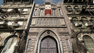
The Building project came to a successful conclusion, the Assassins bureau stood proudly between the neighbouring buildlings.

 
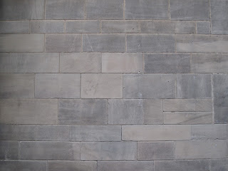
The cathedrals near campus provided excellent tiling textures, I felt spoilt for choice given how many were available, however at the end of the day I wished for the model to blend in with the Blitz example meshes, this factor made me determine whihc was most suitable.


For the statues I had hoped to paint on the textures to add extra detail, however this turned out disastrous so I painted a rock texture instead which actually looked like an improvement.
 
So from here on in it's all about UDK, naturally I was like 'eeep', but after browsing through the linked tutorials on Dmuga I was feeling more confident. This process however was long and tedious, and above all, I learnt the hard way of the importance of naming assets, Once it was exported into the engine, I encountered this....
 
Multi/Sub-Object we'd you go!?
 

Only one element was available for applying my textures. After devoting the whole day to ensuring all materials and meshes were appropriatly named I still encountered this. Saving as an alternative file allowed the multi/ sub-object to show up, yet in return it didn't import my collisions, so for a brief period I was forced to have a ghostly cathedral :/ Either or really....

However, after much toiling over I miraculously managed to successfully import everything. I took great joy in utilising the 1st person shooter playing of Unreal and taking out my bottled frustration on incinerating my building. Currently just need to finish importing the exmple meshes then it's all good to go, so long as UDK can tolerate me trying to be a good student and saving regularly, only to have it not respond at 75%....

Meanwhile the War of the Worlds project has been the prioraty for Visual Design, I have admired certain peoples ideas ( and there drawing style in general) although I have had pretty solid ideas myself, I have tried not to focus so much on the legs of the tripod since legs were the prime focus of the vehcile project.


I quite liked the idea of an aquatic based one, either like a carapce or with the anatomical features of a jelly fish. On the other hand I also felt that another interesting path was the idea of the tripod being possessed or having something latched onto it,  like the Dalek mutant or some form of creature with tentacles. While I quite like the stuff I've done so far, I worry that they just resemble existing stuff I really like and just stuck some mechanical legs underneath it. I should really decide which path I want to choose as I want to tackle the remainder of  outstanding stuff that could use tweaking before the assessment.


Thursday, 8 November 2012

So THATS what they want.......

So the work progresses in as per usual. after spending Tuesday in the labs I try to mentally lay out my week ahead, catergorising whats most outstanding etc.

It would seen things have been tweaked here and there in this year structure, althugh this was told on the first day, I didn't expect it from Game Production in all honesty. Instead of the Blitz Treasure Chest I was expecting, We are doing a building project instead. I standard New York city Street block scene with a gap inbetween, we could fill it whatever we want, plus No tris limit AND NO texture budget. dude....


Although we can put WHATEVER we want there, I would like it to vaguely blend with the design of the neighbouring blocks.
 
I decided to go for a Cathedral entrance, It's one of my muses, given my liking for complex detail and what have you. Another reason I think I chose this was because I wanted to build statues, you see them all the time inside,outside and nearby cathedrals. Of course I was torn as to what position I would have them in, so I assembled some well known examples to aid me.

 
So much cool fiction to choose from, in the end I decided to go for a battle stance pose, so I logged into WoW (yes, I know don't judge me) and got my paladin into some idle poses....
 
What doesn't help is that they aren't anatomically accurate....
 
I wanted to have two on pedestals with a staircase inbetween them leading to the arched entrance,  However once I'd built the figures minus the hands and head, I found myself remembering the Assassin Fortress of Masyaf, and that instantly made me decide to theme my cathedral. Also this meant I had to rewind and reconfigure my stautues. Getting the geometry right was a bitch but the end result was worth it! I decided to use the Argonath from LOTR because their pose was just cool, plkus with the hidden blades retracted, it's quite intimidating.
 
Once I'd built the doorway and archs, I paused because I realised that with my new theme, cathedrals walls can be laid out in numerous ways, furthermore I had various ways in the my mind and how to display the Assassins occupancy there.


Ready for unwrapping!
 

 Moving on, last weeks Crit lecture was very insightful because we were told in detail how this module is assessed and what exactly makes up the marks. Aside from completing the Mandatory tasks set in the handbook with images and links, what takes our mark further is:
 
Research
Personal Reflection
Engaged Writing
 
All this can be easily achieved, by reseacrching I can find out more to write about the subject at hand and extend my blogs. And by reflection, ideally writing positive information as well as cutting myself down from etc.
 

Wednesday, 7 November 2012

Composition

Composition involves the placement of assets within an image to increase their value. When producing a peice of work, be it a sketch/paint and shot from a 3D scene, assets can't just be placed anywhere. Well they can but it wouldn't be as effective at the end of the day. Regardless of whether it's a single asset or mutliple ones, if a piece is to truly shine, then they need to have a corrasponding place.

As well as deciding where on the page it's going to go, there are additional facts in take into consideration, the following are ones which I wish to use most frequently when given the opportunity:

Colour and Lighting:
By lighting up certain areas of the image, it can make it the focus point of the piece and direct attention to itself, darkening/lighting at a scene can also influence the atmosphere that it is trying to represent. Choice of colour can make a difference as well, whether they merge together well or cause one fo them to stand out amongst the others, also making it a focus point.

Depth/Layers:
On occasion I have utilised layers to create depth in certain pices where I deem it suitable. The terms background and foreground are used often for artwork, but in particular pieces of work like environment it is possible to have multiple layers to give a sense of distance in a piece.

Viewpoints:
The angle at which the photo is taken, is it from straight on, at an angle, above or below? Furthermore the latter two can been off a sense of superiority, if you'rre looking up at some thing you can feel small and intimidated etc.


In addition there are compositional techniques which can help artists achieve the purpose of thier work, depneding on the subject of course.

http://www.photographymad.com/pages/view/10-top-photography-composition-rules

Rule of thirds: Something I have experienced a lot in GCSE Art, griding the page up 3x3 for guidlines. This is so that the main elements are along the lines are at the points were they meet. The purpose of this is to give balance.

The girl is the main object, see how she is placed along one of the line, and how the horizon is as well. Furthermore, the upper three is light whereas the bottom is darkest.

Rule of Odds: Having an odd number of assets proves to be more effective than an even number, if a piece contained 2 for example the view woud be torn between them etc.

Rule of Space: Also know as lead room (....huh?), this is to provide the essence of movement in a piece of work. So this would be an almost compulsory requirement for vehicle concept. It basiclly involves providing a decnt amount of space in front of the vehicle to give a sense of direction and movement. If you can say to yourself ''Ah i see where that's going, then this rule has been applied.

Simplification: No. Absolutly not. No way Jose. It's should be established now that I am not capable of simplifying. Period. I cannot help it, the time I slaved in Abbey Park doing individual leaves istead of using a convenient foliage brush. Some things never change.

Limited Focus: Something I have seen often in film and TV, in particular scenes which have proven to catch my eye, using depth to create a foreground/background one of the latter is blurred to make of other stand out, often because it is the primary asset.


In regards to my finals in the past, at the time I have chosen shots which I densly populated with multiple assests, simply because that's how I roll, however having looked into these numerous techniques, I hope to apply them more evidently in the future, excuding simplification. E.g abbey and the train, I zoom in so far to work in the minutest of areas before zooming out and lamentig on what a waste of time that was.....


Wednesday, 17 October 2012

Where to begin...

I'm no stranger to poor planning, in the past when a final piece or end result was expected I just flung myself straight into an large complex piece. Normally half way me realising the futility of it and how it was gonna take longer than expected. Now it is evident that this cannot afford to continue. Concept and planning are words that we've heard frequently since first stepping into the Fletcher Building, and for all too good a reason, there are the foundations of ANY successful piece of work produced, be it a 3D scene or a piece of concept art.

From the planning perspective my flaw is time management (still), it's the first thing that comes to mind, as we're told the time we have is ridiculous! There have been days when I get up with good intentions and mentally lay out what I hope to accomplish, and it often results in either spending too long on one certain aspect or just stretching it out throughout the day and having a classic procrastination. For example, the trash project in which we have 3 weeks to complete, it is so basic a task that I had the following planned out: Week 1, model the mesh and gather pictures, Week 2. unwrap and texture, Week 3 maps and any other improvements, In the third week now and I'm still working on my maps and tweaking the diffuse. Not that I view certain modules over others, but there have been times where I need to prioratise which is the most important task at the time and which requires more time for it.


So by deciding what tasks I wish to focus on which days I can tick things off my list,

Next to time management, the other factor which is crucial to me is reference, usually for 3D for textures and so on, there really is no point starting out a piece with nothing to work from, even the most creative of us must have a muse or inspiration. For example, today in Mitch's workshop which involves making a Middle Eastern Market, this was convenient for me as I've lived in Oman for 4 years, also my instant references were Mos Espa from Tattoine and Jeruselam and Damuscuss from AC


I refreshed my memories through Google Images which is my source for referencing for 2D work, and found images to the common traditional architecture. Bottom line: I now have my camera on me at all times :)

Thumbnails are the center point to all our 2D work, the more the better. They are brillaint references that we use to record the atmosphere of a location and helps us decide what we want for our final. Whilst they are a quick and simple way of working, I STILL find myself unhappy with just having blocks in my thumbnail even though that is generally alll that could be needed, having said that, I have somehow managed to restrict the level of detail I used to get into, I only wish the same could be applied for finals.....leaves.......train engines.....

Cannot begin to explain how much I zoomed into places to get all the fine detail


Last week at the train station was profitable because not only did it have a bleak baren surrounding to it, it also helped with my perspective which I have been meaning to improve.

One thing which I havn't done much of in the planning process is record (scan in/upload) scraped ideas or duds, mainly out of fear that they aren't worthy of being displayed to all to see. On the other hand, I feel as if I don't produce enough thumbs ( as a result fo over working into some) so that I can't divide unused ones rom ones I'm pleased with, so from this little self analysis It would seen that I need to..make more mistakes? Or at least keep hold of them and have reasons for it. I guess its just me trying to get everything right first hand, saves me using rubbers and so on!

Tuesday, 16 October 2012

Dredd: It wasn't dreddful (facepalm)

Last week the guys and I went to see Dredd 3D, only to discover that it was not being shown in 3D any more- much to the organisers chargin. I came along because the last time I went to the cinema was for The Dark Knight Rises and it looked like your stereotypical guy movie, action packed and full of artillery. And also because my flatmate insisted that it was 'awesome' on more than one occasion, I almost contempleted keeping a tally!


I was aware that it was a reboot of the Judge Dredd franchise and was not related story-wise to the 1995 film starring Rambo (Stallone), so I was optimistic as to what was in store. From what I have seen in reboots or remakes of past films is that they make it visually more staggering yet they include flaws like a weak storyline or what have you . In truth, in the past I havn't often put much though into films after seeing them, sometimes because its not in the group bigger then 2-3 so a discussion with multiple views can't arise.

Taking place within a Mega City in an oh-so-familair semi post apocalyptic future, the plot involves famed and feared Judge Dredd taking rookie judge Anderson on a field assignment in order for her to pass. The judges wield the authority of judge,jury and executioner, allowing them to condemn their targets on the spot. The major premise of this film is within a Mega Block skyscraper Peach Trees where the duo's routine job exculates into a lockdown of the tower. They must then fight their way up through 200 stories of armed gang members to eliminate their leader Ma-Ma and halt the prodcution and distribution of Slo-Mo, a new narcotic that is spreading throughout the Mega City. Cut off and with communications offline, the master and apprentice must engage the masses and bring judgement on those who would defy the law. IT'S JUDGEMENT TIME.

It would be impossible to talk about this without going back to the namesake; I havn't watch the 1995 film so I can't make a comparrison. But just by looking at him in the opening scene as he steps out after donning his signature armour you can tell he means business, Albiet the helm, badge and shoulderguards, he resembles a riot squad/special forces so it's clear he gets right in there- being a street Judge and all. His overall figure and armour is much more effective than Stallones, I mean look at the size of that bling! Don't get me wrong the eagle is a new design, but it would either weigh him down or it would jiggle too much and be a nuisence, and is that a codpiece??

The opening scene where he intercepts and judges a gang in a street chase pretty much defines how this guy rolls to newbies like me. However once he teams up with the telepathic Anderson its almost Ying/Yang. Dredd is an emotionless sentinel who serves only to enforce the law, his job is short and clean in his book:

Brake the law: Sentance them
Resistance: Use lethal force

Information required: Brutal interrogation

He shows no remorse or sympathy from behind that visor. In spite of that he is totally the kind of guy civillians would wnt to cower behind while he obliterates hostiles. Once they hit the streets Anderson is straight away identified as the humanity of the two, compassionate and thoughful. Initially she shows reluctance to carry out judgement, even those at her mercy. However she evolves and adapts at a remarkable rate as the film progresses. When they first meet there was a point where she 'looked inside of him' I assumed at later in the film she would ask about his background and emotionally compromise him, however this wasn't the case. It probably would have been a break for the film, redefining Dredd and showing he wasn't always the way he is then etc. Furthermore, it is mentioned that the Judges helmets disrupt her powers so that was kinda a relief.

City maps and tourist information must be a bitch!
 

The lifts must be a nightmare...
 

I didn't mind that the bulk of the film took part in Peach Trees, however one of the first shots of the film was a zoomed out view of Mega City 1, it would have been interesting to see more of this vast metropolis maybe. Furthermore, the whole plot of fighting up through a tower reminded me of the film The Raid, where a Special Ops team had to eradicate a gang holed up in there. However I have not seen that a nd reviewers who have seen both have confirmed with relief that the two films are not related storywise, the latter involving more martial arts and that.

The featured drug Slo-Mo lives up to its name: it slows the users perception of time to that of 1% of normal rate, so like living in slow motion of god knwos how long. This was a brilliant reason to use many slow motion scenes, many of them beautifual and just plain bloody, usually at the same time!
 
To give my view in a nutshell, this was a visually lush film, it's certainly gotten rated 18 for a reason, with the bloody carnage, anatomically correct shootings and flashing images of torture and worse. However it also captured the natural beauty too, I might be basing that solely on the bath water scene... In the intervals between gunfire the scenes feature the similarities ans difference between the two protagonists and how they eventually find themselves on the same ground. With his gruff voice and unchanging partial face expression, from what I have seen of Dredd, I think it lives up to the fans expectations.


Thursday, 11 October 2012

What a plie of...

So to get us back into the swing if things We got ourselves a pile of trash. I don't wanna jinx it or anything but it has been rather easy so far, considering the prime assets are basic shapes and all. Aside from boxes and bin bags, I decided to make my pile a dumping ground for takeaway food, since that is the most common type of trash you see on the streets. So yeah drinks, pizza box, Happy Meals and so on.


I did take some consideration into 'interesting' assets I could include, however given the 500 tris budget, my first ideas would be too expensive, and at this point having seen other peoples additions, I didn't wanna steal their thunder per say so I'm satisfied with what I've come up with.

I found myself with additional tris left over in the process so I used them to rough up some of the assets. This project is also an opportunity for me to be formally introduced to Zbrush, having seen the results and sculpted bin bags, the appearence looks impressive when enhanced, to get the effect of all the creases in the bag.

Right now I'm working on the diffuse and learning how I will go about sculpting, I can tell there won't be any shortcut to this, just like everything else!

Sunday, 7 October 2012

Thus begins round two

Yes I will admit it would seem that I was caught within the radius of the exexutioners swing, but I was able to redeem myself and now I'm back, given another chance.

Year 2 is here after what has felt like almost half an entire year, so it's time to get back into the swing of things and work hardER! Unlike this time last year I now know what's up ahead and what is expected of me, although I am still curious and shitting myself about UDK, since it will dominate most of this year AND the whole of next year, but I'll cross that bridge when we come to it.

So given all this time off I am relieved that I did do some work, I chose the summer project title 'Rain Forest Crashsite' since I had always had issues getting my alpha channels to come out right, and thankfully, no major issues arose during the creation and I am rather pleased with the end result.


As stated before I'm still in a state of envy over other peeps digi work, I'm getting there but I would be even better if I just did more of it, aside from the random doodles in little sketchbooks, the only accomplished pieces I did were a couple fo portaits. Having brushed the dust off the intuos (shocking I know) for the first time in about a month or so, I found they went bizarely well first time round.


So already my diary is full of activity, having spend most of the week down at Abbey Park doing thumbs and sketches. British weather was in its prime, as in I had to stand and wait for the perfect shot of sunlight in a photo etc.


This final was my bane in all honesty, I broke into my habit of doing each of the leaves ONE BY ONE, it was only after 2 hours later that I fully explored the brushes and found ideal ones to make trees look fancy and simple. Lost track how long this took overall, but the end result was definatly worth the hassle.
 
Off to see the trains tommorow.